


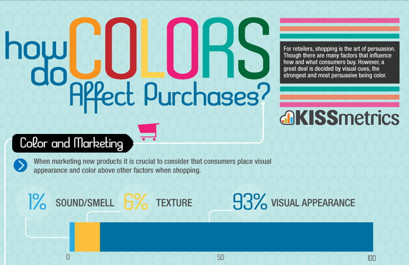
Colour Psychology is one of the more well-known concepts in pop psychology. We’ve probably even taken quizzes promising to tell us our personality traits based on our favourite colours. While the reliability of such quizzes is in grave doubt, it has been proved that colours influence our mood and feelings, hence the increasing importance given to the colour in which we want to paint our room. Colour psychology, is in fact widely used to influence attitudes, and the best exercise in persuasion is marketing! It is extremely effective too. As per a recent research, 90% of the immediate judgments that people make about products are majorly influenced by colour alone.
So here is a look at how advertisers attempt to influence our attitudes by evoking images of certain colours-
1) Red
One of the most frequently used colour in brand logos, red is used to, first of all, grab attention. Red is the most stimulating colour and immediately stands out against the background. Suggesting excitement and power, it is no wonder that some of the biggest brands use red in their logos. As an example, look at the logos of Vodafone, Airtel & Virgin Mobile. Other brands include Coca-Cola, Boost, Nestle.

![]() 2) Blue
2) Blue
Another hit among advertisers, blue denotes dependence and trust, also explaining why it is typically used by public, private and government bodies (SBI, BCCI, Aakashvani). Some of the biggest rivalries among brands are played out in the form of red vs blue. Think Coca-Cola vs Pepsi, Colgate vs Pepsodent vs Oral-B, LG vs Samsung vs Philips, among others. Blue is also a favourite of social networking and blogging sites like Facebook, Twitter, WordPress, Tumblr, predictably to assure security.
![]()
![]()
3) Green
Since green evokes the virtues of health, freshness and growth, it is used particularly in the packaging and advertising of food products (Rasna, Tropicana, Tata Tea, Dabur) and household and medicinal products (Vim, Prill, Ariel, Vicks, Zandu Balm, Dettol). The most obvious association of green is with the environment and that is why environmental organisations, as well as those who want you to believe they are eco-friendly, will always use green – to draw upon and reinforce that association.


4) Yellow/ Orange
Fun, frolic and friendliness will be the motto of brands that make use of yellow and orange. That is why popular food chains such as McDonalds and Subway use yellow in their advertising. Interestingly, online retail stores such as Jabong, Flipkart and Myntra ( to a lesser extent) use orange in their logos, to reiterate the belief that shopping with them is a fun experience. Flipkart uses blue and orange to signify friendliness and trustworthiness. Another eye catching logo is that of Nickelodeon, relying entirely on yellow and orange.


5) Black
Black is classic. Black is exclusive. Black is sophisticated. No wonder black is almost exclusively used by high-end and luxury brands. Advertisers often use a combination of gold or silver along with black to lend an aura of glamour to their product. It seems to be a particular favourite of high-end fashion brands, what with Mango, Zara, French Connection, Chanel, Yves Saint Laurent all boasting of black logos. The motive is to seem understated and elegant. Some of the other brands making use of black lettering include Volkswagen, The Taj, Rolex.


