


Breakfast Babble: ED’s own little space on the interwebs where we gather to discuss ideas and get pumped up for the day. We judge things too. Sometimes. Always. Whatever, call it catharsis and join in people.
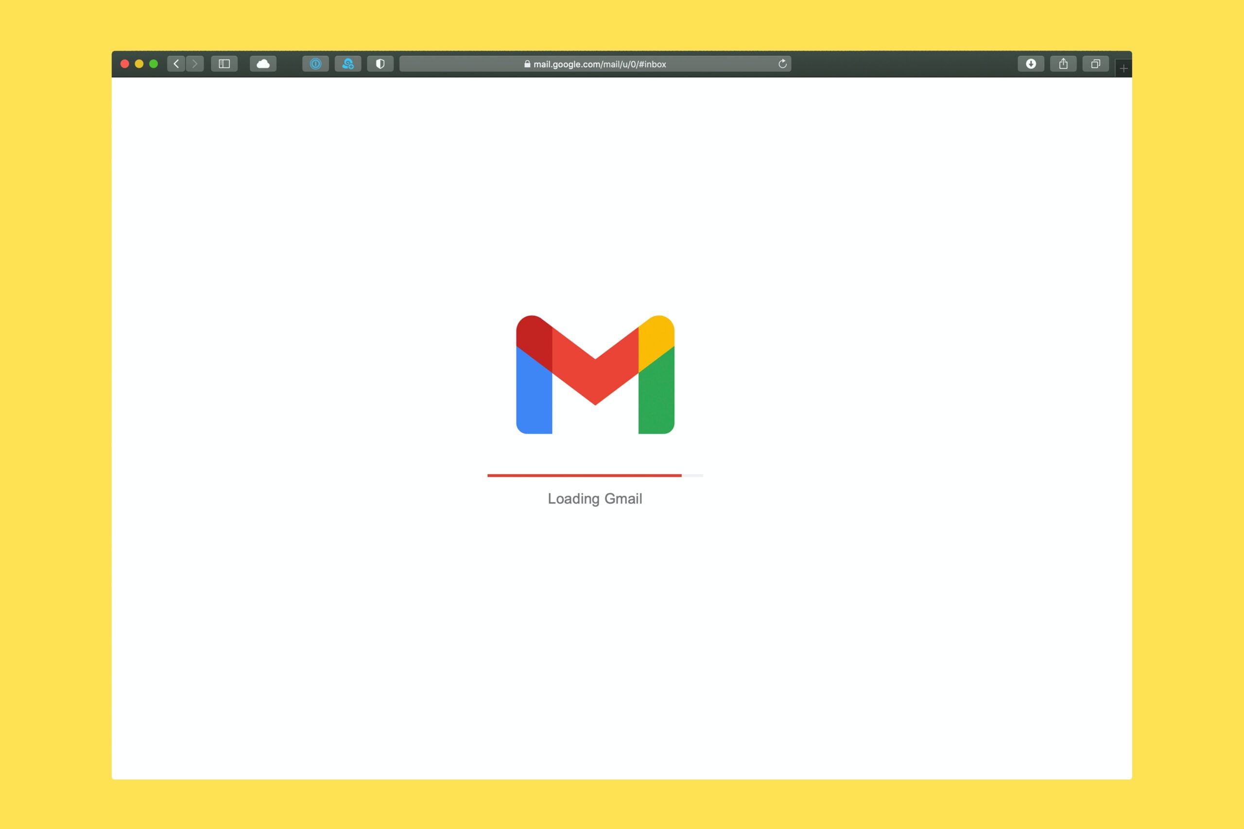
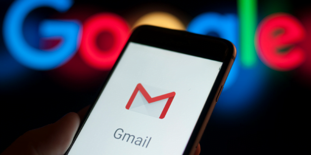
The classic Gmail logo that had been constant for the past seven years looked like an envelope in white with borders covered in red. However, the new Gmail logo is a letter M consisting of four colours: blue, red, green, and a pop of yellow.
I guess it won’t be an exaggeration to say, humans, neither adopt nor react to change very well. A simple yet significant example of this (myself included, of course) can be seen regarding the new Gmail logo of Google by the users, that started rolling out earlier this month.
Read more: New Gmail Update 2018 Introduces Self Destruct Emails And The Option To Snooze Them
Because I, for one (and my eyes), am finding it quite difficult to adjust to it. Not to mention, its ability to blend well among the other plethora of Google applications on my toolbar (after all, they all seem the same to me). However, I know for a fact that I am not the only one in the crowd to feel this way.
There are also complaints from other Gmail users left, right and centre on the same issue. Some find the new Gmail logo confusing, while others are switching to different email devices altogether. A few believe that it has significantly reduced their productivity.
Some even blame it for their ruining mornings with its annoyingly bright eye-prickly colour combination while the rest think that the new Gmail logo was the last thing one can imagine going wrong in 2020.
Well, they are right. The new Gmail logo feels like the last straw that broke this year for everyone.
After all, the last time Google changed its logo was in 2013.
Even though the quad colour mix represents Google’s staple identity, in terms of visibility, it’s truly inconvenient to many users, especially the eyes. This too in the beginning.
Although, it is not clear if Google will bring a change anytime soon given the user’s feedback. But if it does not, then Gmail users have no option but to get used to it!
Image Credits: Unsplash, Google images
Find the blogger: @sejalsejals38
This post is tagged under: Gmail, Gmail new features, Google new Gmail logo, Google, New Gmail logo, Gmail, Email, 2020, COVID-19, Pandemic
Other Recommendations:
Why Did Rivals Facebook And Google Invest In Telecom Giant Jio?


