Within just days of release of iPhone 7, Apple has released the newest upgrade to their OS i.e., the iOS 10. The upgrade is made available for iPhone 5 or newer and iPad 4 or newer, which means we finally bid goodbye to our beloved iPhone 4s.
Making its way in a highly competitive market and already struggling through ‘bricking’ bugs, the latest iOS is actually a breath of fresh air as compared to its previous versions. I quickly upgraded my iOS and got back with the review for you right here. Check it out:
Getting Started:
The size of the upgrade significantly large, somewhere around 850 MB. So makes sure, you got space. After installing, the iPhone restarts, asks a few passwords and welcomes you to the home screen.
What you initially might have missed out, is that Apple finally let go off its very popular ‘swipe to unlock’ feature with this upgrade and replaced it with ‘press to unlock’. The new gesture is hard to get to use to but well, it’s seemingly cool.
After that, what you encounter next is the new ‘Home’ app. As the name suggests, the app is a homekit app and is your go to place to manage all your smart home gadgets in just one place. Kinda cool for Apple to bring in something new and probably employable in daily use, to the smartphone world.
Another new feature with iOS 10 are the new widgets that appear with swiping left onto the home screen. Apple has been continuously remodelling its widgets appearance and hands down, it has never been disappointing. With the new customisable widgets, it gives a lot of power to the user which is mostly the aim of any new upgrade.
Swiping down, we are faced with another new change. The ‘Notifications’ feature has also been stylised with this iOS, quite handy but takes a little time to get used to.
http://i67.tinypic.com/2h5nqyf.png
Getting into more details the complete makeover of the ‘Photos’ app is a remarkable change. It’s been long since any of Apple’s previous updates touched that area and as you can see it has quite been changed and for the better good. It’s easier and a bit sassy too.
The other new welcomed changed is that of the ‘Messages’ app. One of the most primer sources of communications between iPhone users, Apple’s ‘Messages’ app has been improved significantly.
Designed to compete strongly with Facebook’s ‘Messenger’ and ‘Whatsapp’ app, ‘Messages’ now allows third party integration alongside exciting additions such as GIF messages, handwritten messages, photo messages with doodles, messages with laser light (digital touch messages) etc.
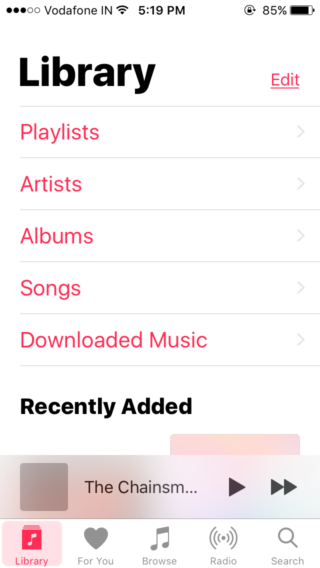
Welcoming a list of changes, the ‘Music’ app has also been reorganised. Bolder and clearer, using ‘Music’ has actually become a lot easier since the last update, iOS 9. It’s not clumsy and traversing music has gotten a plenty of simplification.
Last but not the least, iOS 10 finally lands its users the authority to remove built-in apps and rid the iPhone of unnecessary factory installed apps. So long, ‘Stocks‘.
The Final Verdict:
iOS 10 offers the users a fresh new experience of Apple’s ever changing technology, without actually having to force them into buying the newest smartphone.
The inclusion of new features that are comparatively old to Google’s newest Android, the efforts are not completely redundant.
They add to the whole Apple experience more than any other upgrade up until now. There’s a lot of scope of developments in Music as well as in the Notifications scenario of iOS but, for now, the changes are welcomed.
| CRITERION | RATING (OUT OF 5) |
| Concept | 3.5 |
| User Interface | 3.0 |
| Features | 4.0 |
If you liked reading this, you might wanna check out:
http://edtimes.in/2016/06/ios10-features/


