From selfies, groupies, ‘woke up like this’ to amateur photography – with advanced cameras being available in every mobile phone we click pictures daily. With this idea in mind, Instagram – a photo and video sharing social networking site has become quite popular.
Even though you have been using this social networking site for years, you might feel that you can’t seem to get the hang of it. More so because, with you posting random pictures for years, your feed looks unorganized and clumsy.
Here’s a list of 9 tricks and tips that might help you give your Instagram page an aesthetic professional look.
1. Instagram Filters
Stop with it already. There are multiple editing apps in Android and iOS, use them. Most editing apps are free to use and are quite user-friendly. Plus they are more than enough for your basic editing. If you want, you can buy their paid features as well.
Suggested app: Picsart and Pixlr.
View this post on Instagram
2. Don’t Fade Away
Try to avoid filters that either gives your picture a ‘faded look’ or a ‘high contrast look’. It needs quite a bit of skill and control to get these looks correct. Try the easier way, maybe? If the idea is to grab attention, go for a bright and vibrant color scheme.
For example, Brandon Woelfel became popular for his unique style of using bright neon colors in his pictures.
View this post on Instagram
Try to give your pictures a quick edit in the editing apps and give them your personal touch. After all, your picture defines you.
Suggested app: Snapseed and Adobe Lightroom.
3. Think Big, Think 9 At A Time
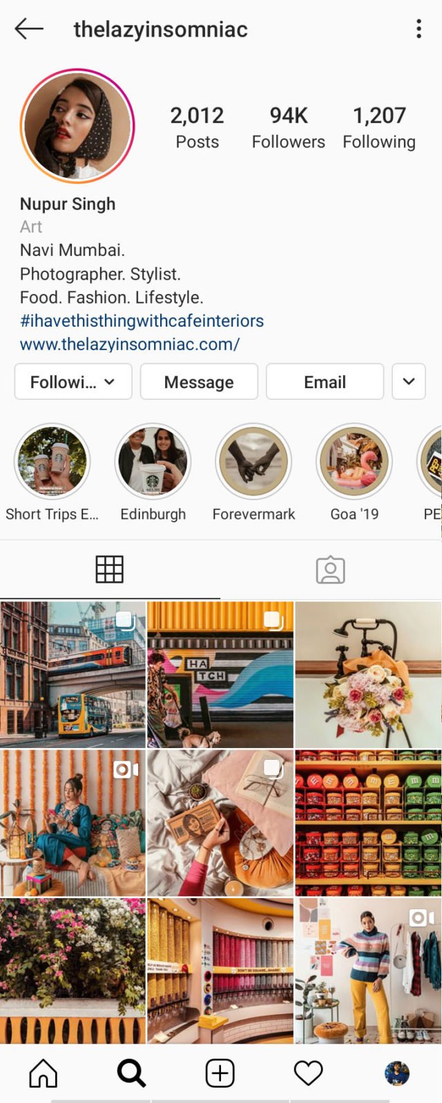
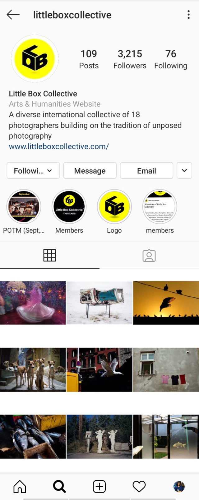
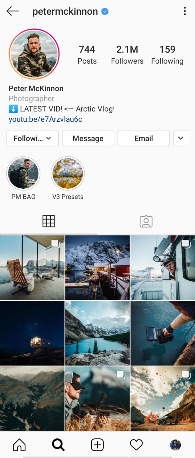
Yes, you post one picture at a time. But when someone opens your profile, they see the latest 9 pictures of your feed simultaneously, as one big picture.
This 9 is what makes them decide whether your feed is worth scrolling or is it just another unorganized feed. So, plan ahead. When you post your picture, see that it goes with the previous 8.
Also Read: Did Anyone Check Swiggy’s Instagram? With Just 9 Stories, They Are All Over The Internet
4. Stick To A Theme
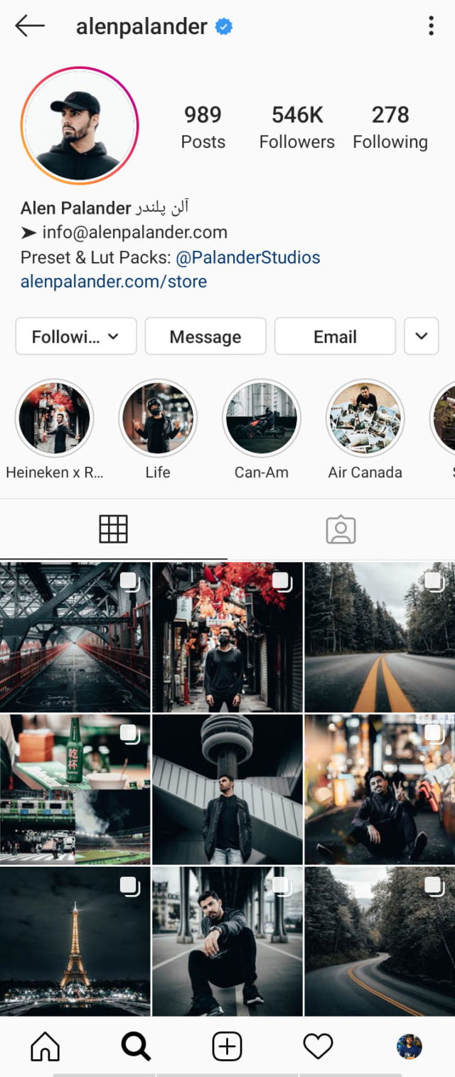
To make the set of 9 attractive, you need to make them look like one cohesive unit. Sounds complicated? Well, you can simply stick to a topic or an idea as a theme for your 9 posts.
But what if you click pictures just for fun and don’t like to give too much of a thought?
Well, you can simply choose a color as a theme for your set of 9. Pick 9 pictures with the same color as the prominent one, tweak those pictures in the editing apps and bump that particular colour a little, and you are good to go.
Suggested app: Snapseed and Adobe Lightroom.
5. ‘3×4’ Or ‘1×1’?
Instagram previously allowed its users to post pictures with an aspect ratio of 1×1. Later on, it started supporting 3×4 and 4×3 as well.
Before you upload the pictures in these aspect ratios, keep in mind that your feed thumbnails will be displayed in 1×1 again. So, crop and adjust accordingly.
Suggested app: No Crop Pic for Instagram and SquarePic.
6. Feeling Lazy? Add A Border
Giving a frame to a picture gives it a bit more definition. Quick tip – Add white borders to all your 9 pictures and et voilà! You have a color theme.
This makes the pictures prominent since Instagram has a white background. With dark mode available in iOS this idea makes your picture stand out all the more. Win-win!
Suggested app: InShot and Square Pic.
7. Preview Please!
Is it difficult to keep all these in mind and post? Certainly yes. Especially if you have to imagine what your feed is going to look like after 9 posts.
Well, there are apps to help you out- apps that let you plan your feed. You can simply upload 9 pictures of your choice into these apps and then adjust their position, i.e, see the sequence you should upload to give your page the desired look.
Suggested app: Preview (iOS) and PLANOLY.
8. Transition
After your first 9 is done, don’t change to a different theme for your next 9 abruptly. This will make your page look like it is broken into groups of 9s. So, for a smoother transition, make sure that the last 3 pictures of your previous set and first 3 pictures of your next set have something in common.
9. Third-Person Perspective
In the end, only after posting your 9, ask your friends to give your page a look. If they say they notice a ‘change’, you are good to go.
Simple yet interesting, right? But hey, no need to thank us! You can just give our Instagram page @EDTimes a follow and write your Instagram handle in the comments below so that we can see what kind of look you have given to your page. Godspeed!
Image Credits: Google Images, Google Play, Instagram
Sources: Instagram, YouTube, Preview
Find The Blogger: @AyushArcher05
Other Recommendations:
Watch: Beautiful, Deep Meaning Words That Can Beautify Any Of Your Instagram Caption Or Pictures


