Obviously there is nothing as a perfect map of the world. There are always some discrepancies we are bound to discover in every projection of the earth.
But what if I told you that the map that we use today is 500 years old and hasn’t been updated yet?
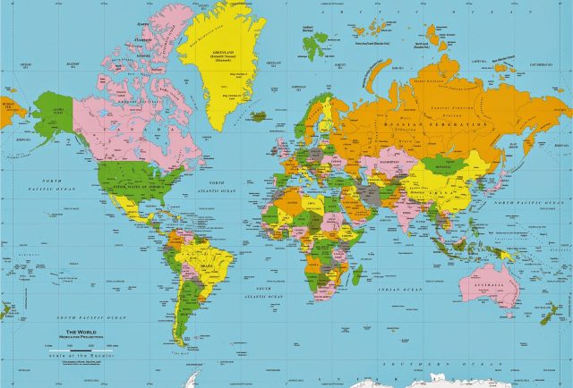
The present map was made by a Flemish cartographer, Gerardus Mercator in 1569. So, if you thought that we have moved on with technology, time to revisit what you had said in the past.
What is wrong with “our” map?

1. In those times, maps were meant to provide a brief outline of trade routes and colonial conquests. Mercator map was solely devised to aid the expeditions and there had been no assurance that it is a correct projection of the world. Just another map by any other explorer.
2. According to recent cartographers, the equator has been pushed downwards. This places Europe at the centre of the map. The Northern Hemisphere appears bigger than the Southern Hemisphere.
3. There are claims that certain European countries have been depicted in larger sizes than they actually are. This is, of course, to shower European chauvinism and to show other countries/colonies are lesser than Europe even cartographically.
Also read: Ever Wondered How Apps Like WhatsApp And Google Maps Earn Money?
What is the correct map of the world, then?
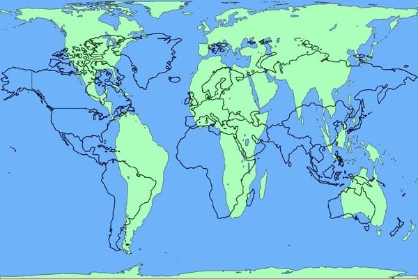
As said before, there is no correct map of the world, but the Gall-Peters projection is being increasingly accepted as the correct projection of the world as we know it.
Finland looks longer from north to south than India, but it is the opposite in reality. 14 Greenlands can fit in one African continent, South America is twice the size of Europe. All these facts cannot be figured out in the Mercator map.

Explain Gall-Peters projection, please?
Okay.
The Gall Peters map is actively advocated by the UNESCO and is adopted by many British schools.
In 1855, a clergyman named James Gall created the projection of the map and presented it to British Association for the Advancement of Science. In 1967, Arno Peters, a German filmmaker devised a similar map and passed it as a “new invention” in 1973.
The Gall-Peters map meant to undo all the problems associated with Mercator map. The East-to-West lines intersected the North-to-South lines at right angles. The countries were equatorially correct, and it was claimed that this was an unbiased projection.
Is it free from errors?
Don’t you dare go ahead and think that the Gall-Peters projection is not problematic.
1. The world is spherical. The latitudes and longitudes are circular in shape. Therefore, there can be no accurate flattening of these circles in lines. When you are changing the basic shape of the world as it is, there is a 100% certainty that whatever image you get of it is untrue.
2. Countries are stretched horizontally across poles and vertically near the equator, therefore even if the measure of landmass is correct, the shape of countries and continents will always be incorrect.
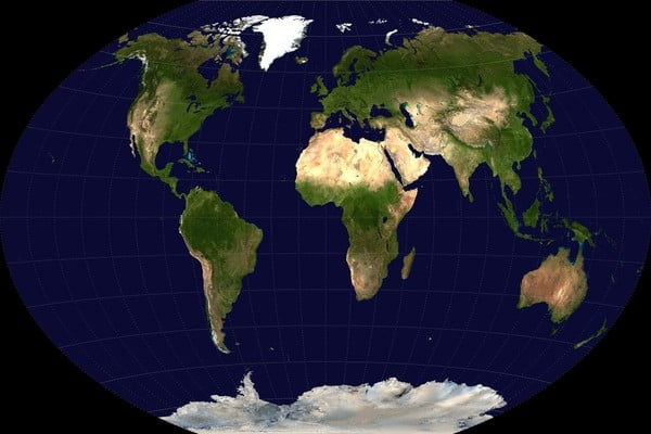
3. Winkel Triple Projection (Winkle III) and the Kavrayskiy VII projection are considered better than the Gall-Peters because they don’t distort the lines and shapes and present the world in quite the same shape as it is.

No matter how many problems a map projection might have, cartographers have agreed to one thing – nothing can ever beat a globe.
(Image Credits: Google Images)
Other Recommendations:
http://edtimes.in/2017/03/google-maps-latest-update-is-now-going-to-help-find-your-friend-in-the-next-crowded-mall/
http://edtimes.in/2015/10/technology-i-love-you-but-i-hate-you/


