With over 70% of internet services being used via mobile phones in India, YES BANK has come up with its revamped mobile website for the public to be a forerunner in digital banking services and we discuss how.
The new website by YES BANK now offers a simpler approach to categorize and simplify product groupings and their requirement, thus catering to different needs in a more organised manner, with minimalism displayed via multiple icons and fonts for visual relief.
The YES BANK site now uses quick search tools such as the Product Finder Tool coupled with Product Based Listing. It also offers a smart, personalized interface where it suggests offers and products based on user behavior and user interactions.

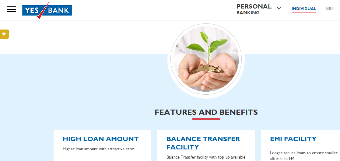
One of its standout features is the Home Loan feature, where one can apply for 5 different types of home loan such as Home Purchase Loan, Home Improvement Loan, Home Loan for the Self Employed, etc. and just download an e-form to apply online easily with longer tenure for pocket-friendly EMIs.

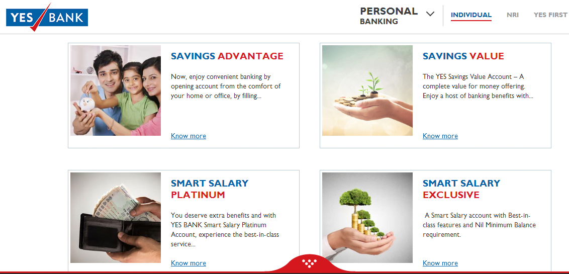
The other exciting feature is the Savings Account feature, which is easily accessible via the mobile website and allows the user to open a Savings Account that gives him/her a higher earn of interest of 6% p.a.* and offers various modes to open a Savings Account such as Exclusive, Select, Platinum, etc. for various purposes. Benefits of this include money monitoring, net and SMS banking, free utility bill payment, etc.

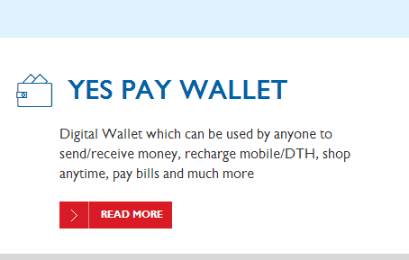
Another prime focus is the Yes Pay Wallet, which allows you to pay DTH or mobile bills, send money, receive money and even online shopping!
The Yes Tax Solutions which offer expert consultancy on tax payments with online payment options.
All the above-mentioned features are displayed under the Transaction Zone with easy-to-understand FAQs tagged to every section, making the site more helpful and informative.
To make it more user-esque, YES BANK has made an effort to inculcate 3rd parties for promotion on websites such as Facebook, Twitter, YouTube, etc. and incorporate a review and rating system by the users to help the website function better in case there are any glitches. Also, social sharing on blogs, vlogs and videos has been made available.
With the features added and ready to test, the website now works faster for downloading documents and filling up forms, which further highlights the efficiency and quick response time, as demanded by the modern day user.
YES BANK has further improved its user interface on the website by retaining their services but under different product names, by making them sound simpler instead of branding them with tags to incorporate better understanding from a customer point of view rather than a business point of view.
To sum it up, whenever you design a product, it’s always advisable to think what your user may want out of it and not what you would. This simple plan has been executed with almost utmost perfection by YES BANK to rejuvenate their website and step into digi-banking services, only to tip themselves to be front-runners with a constant drive to strive for perfection.


